Thursday, February 28, 2019

Monday, June 4, 2018


Tuesday, May 29, 2018
Project 13: Stop Motion Animation
In my stop motion video two elephant friends go on an adventure to make cupcakes since one of the friends is hungry. To make it T just set up all the ingredients and adjusted them between the shoots.
Wednesday, May 16, 2018
Wednesday, April 4, 2018
Project 10: Portrait Photography
Commercial Portraits


To take these two photos I went in the courtyard of my apartment building and
had my brother and his girlfriend pose for me in several different ways. For
my commercial portraits I wanted them to have the feel and look of a fashion
magazine so thats how I positioned them to look. These function as commercial
portraits because they are supposed to appeal to the audience and encourage them
to buy the magazine rather than just be fine art.
Fine Art


To take these photos I got some string lights and I wrapped my brother and his
girlfriend in the string lights turned off the lights and took as many photos as
I could. I told them to make whatever faces they felt like making to try and get
a meaningful emotion and photo out of the shoot. These function as fine art portraits
because they are meant to show something beyond the photo.
Friday, March 9, 2018
Fine Art vs. Commercial Portrait
| Matt Holyoak |
In this photos one of the main differences that I noticed was his expression and
composure. In a lot of his photos for magazines he has a very serious look intended to draw the consumer in. But in the fine art photo he just appears to be more himself more.
the colors also differ in the commercial photo the colors are more black and white while the
fine art photo has more soft pastels.
Project 10: Commercial Portrait
Commercial Portrait photography is photography mainly used to
promote or advertise some type of product or brand.
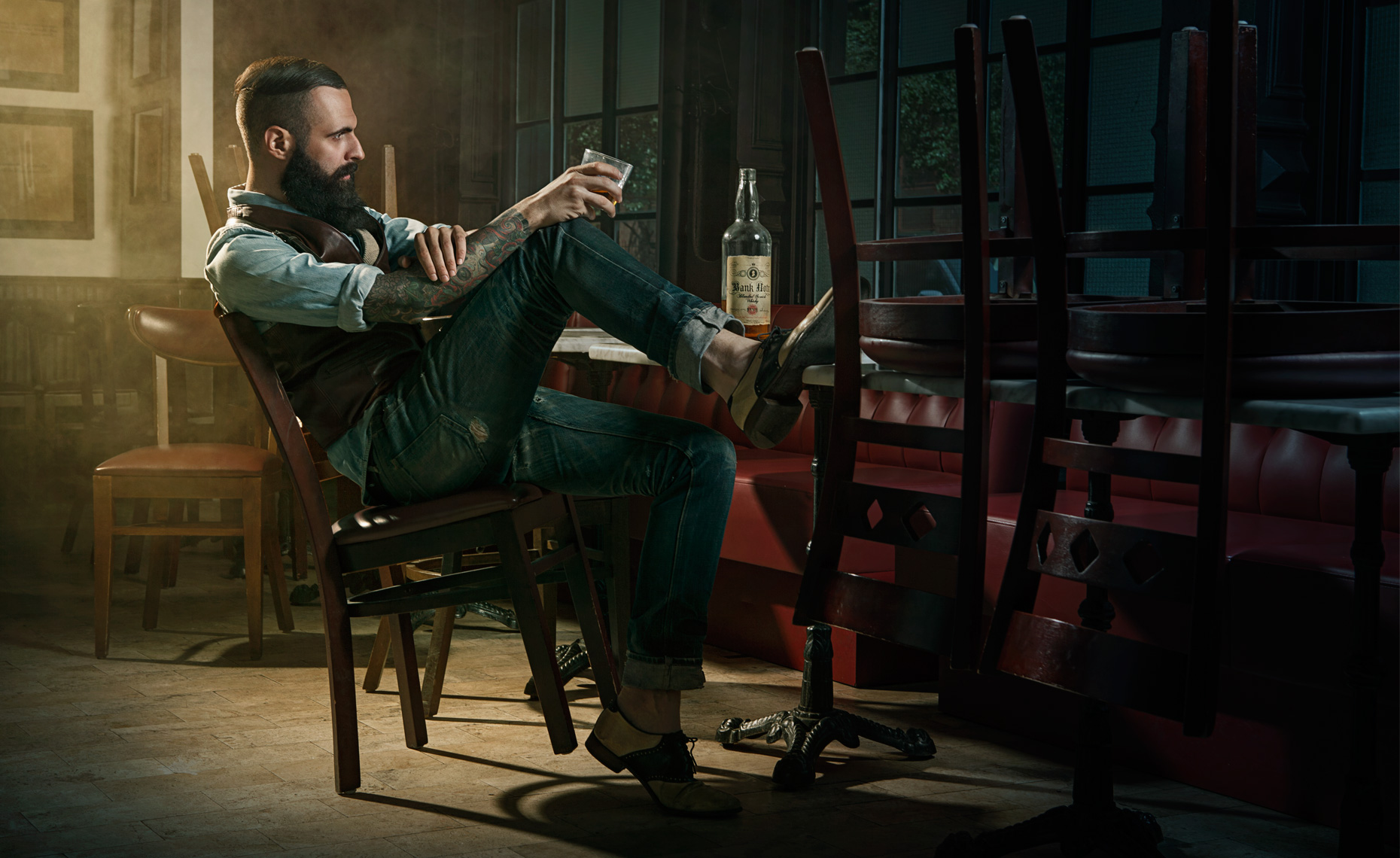 |
| Dale May |
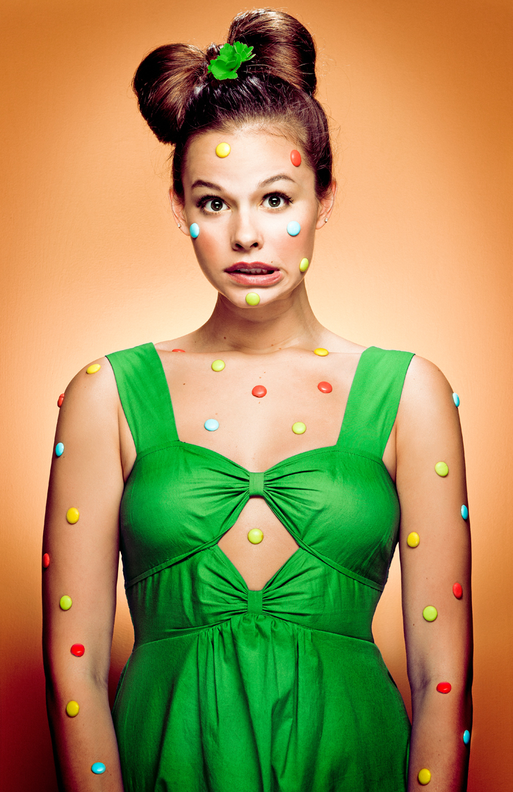 |
| Timothee Bailey |
In the commercial portraits all they are trying to do is sell the product
there is almost zero artistic intent in some commercial portraits.
Project 10: Fine Art Portraits
A fine are portrait is an artistic portrait that is meant to have a
significant deeper meaning and tries to reveal something about the subject.
| Jason Sinn |
 |
| Alberto Alicata |
In these portraits I feel like they are trying to convey the emotions of the subject
so that it feels like you are directly looking into the person without any
barriers of society.
so that it feels like you are directly looking into the person without any
barriers of society.
Project 9: Surrealism and Photomontage
Surrealism is a type of photography that is mainly made up of absurd
surreal images that are impossible in reality.

To make this photo I took photos of two people and put them in this spooky background.
I cut them out from their original background and then cut out and put a computer
screen on their head. I thought the screen was to bland so I then took pictures of their
twitter and Instagram and put that on the screen that is on their head. After all
of this i adjusted the saturation to heavily desaturate the people and their background
and then saturate and brighten the screen. I wanted my photo to be surreal
and crazy but also make some sort of statement and I think I achieved that.
Friday, February 16, 2018
Project 9: Prework
 |
| Vladimir Kush |
 |
| Rene Magritte |
These photos are of more traditional surrealism paintings instead of some more modern techniques.
I like the absurdism of it and the different colors.

| Tommy Inberg |
 |
| Ronny Engelmann |
I like these photos because they have a more modern twist with different elements that were
not used in the older surrealism paintings.
not used in the older surrealism paintings.
Project 8: Digital Alternative Process
A daguerreotype is a style of photography mostly used in the early 1800s.
For this project we used photoshop to simulate this style. We also simulated a cyanotype
which is a style of photo tinted blue and grungy. For me final photo I atempted
a gum bichromate which turned out different then I expected but I still really
liked how it ended up.


Wednesday, January 31, 2018
Reflections of 1st Semester


I feel that I have gained many skills throughout the semester. From learning how to take actually decent photos and editing those photos to make them look better and even do fun and crazy edits to them. When I look back on my photos I can see literally see my improvement. I have gained a decent amount of camera skills. I now know how to use aperture and shutter speed to attain different kinds of photos which I did not know how to do before coming to this class. Other than that I also know how to utilize the elements of art and the principles of design to improve the photos that I take. Easily my favorite project was the multiple image techniques one. I very much enjoyed combining different images together to create interesting and fun multiple exposures. I liked it so much I got Photoshop and Lightroom on my computer at home so I could experiment with it more. When I first started this class I thought photography was just taking pretty photos. And it was, but it also so much more. I saw and learned how people tell stories and express themselves and different concepts and it honestly astounds me. The new photographers that I discovered of the top of my head would be Saul Leiter and Tania Klein. The main thing that I like about their photos is there specific use of colors to create a mood and also Klein's self portraits that she does. I actually notice many things about the world that I would have never noticed if I had not taken photography. I notice interesting things that might make good photos and then all the different ways I could photograph that thing. I also notice the different Elements of Art and Principles of Design in the world. I love learning about new ways to edit photos and use interesting techniques so that is what I'm probably most excited to learn about next semester.
Friday, January 26, 2018

Monday, January 22, 2018
Project 6: Multiple Image Techniques
In this project we used photoshop and different camera settings to create unique techniques such as multiple exposure, panoramas, and HDR images.
 |
| I took the photos that make up this photo as OMSI in a special Illusions exhibit they had. The photo itself is of my brothers and his girlfriends arms with their new tattoos against this striped background that changed color depending on the overhead lights. |
 |
| I took this photo when visiting my friends and its just multiple images of her walking away in the forest and looking back for one. |
 |
| This is a panorama of some bamboo stalks. |
 |
| This panorama I took at Cannon Beach when we drove down last weekend. Its about 180 degrees from the houses on the beach to the ocean. |
 |
| This is an HDR image made from several photos with different shutter speeds from the view of my window. |
 |
| Another HDR of a parking lot lit up by street lamps as the sun is going down and its getting dark outside. |
Friday, January 5, 2018
Project 5: Basic PS and Camera Controls


In this project we learned how to use our basic camera controls on our camera such as aperture and shutter speed. We also used photoshop for the first time for basic editing.
Friday, December 1, 2017
Project 4: Kaleidoscopes
I created these kaleidoscopes by cropping a certain part of an image duplicating that image four times and then reflecting three of the duplicates so that they all converged on a specific point in the middle.
 |
 |
 |
Project 4: Contrast and Balance
In this project we looked at Contrast and Balance and the different types that you can have in a photo such as contrast in size, color, texture, value, shape and the three different types of balance symmetrical, asymmetrical, and radial.
 |
| Contrast in Color |
 |
| Contrast in Size |
 |
| Contrast in Value |
 |
| Contrast in Shape |
 |
| Contrast in Texture |
 |
| Symmetrical Balance |
 |
| Symmetrical Balance |
 |
| Asymmetrical Balance |
Subscribe to:
Posts (Atom)
-
Contrast in Texture by Sebastian Magnani Contrast in Scale by Riccardo Romano Contrast in Color by Jeananne Heng Contrast in ...


